Design for used book selling mobile app
This project started when me and my classmates from Langara College Faisal Sahak, Daniel Gomez, Ammar Haq, decided to learn how to develop a mobile app for both Android and iOS starting from scratch.
We all agreed that buying and selling books on campus is very inconvenient. Hence, the idea was to make a mobile app that'd make book reselling between students easier.
I was responsible for design and UX/UI of the app. My working process contained:
Brainstorm & research
Goals and success measures
Competitive analysis
Personas
Paper wireframing
Color scheme
Digital wireframing using Figma
Brainstorm & research
I started from listing pain points of the students:
Absence of a unified book trading platform for students
Students are forced to buy books on campus at a higher price or browse advertising boards at universities
I continued my research reading a number of articles:
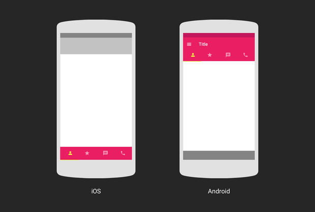
One of the interesting findings was that Android and iOS display the menu differently:
Goals and success measures
After a thorough research I set the following goal - to create a mobile platform for both iOS and Android where students in Vancouver can buy, sell and exchange used study books. The platform has to be more convenient for students than using social media groups.
Success measures
1500 unique users, in a first month after app launch
Growing student sign up
Ongoing user activity within the app
Growing number of downloads from App Store and Google Play Market
Competitive Analysis
Research also helped to define a list of main competitors:
College buy/sell books Facebook group
Physical bookstore
Amazon, eBay
Letgo, Craigslist
Websites that rent books
Research also showed that the majority of students use as their primary source to buy/sell books Facebook group. Which made it our main competitor. Hence, I analyzed College buy/sell books Facebook group in more details:
Advantages
Easy access. All people already have an account on Facebook
Significant audience and reach. There are around 18500 group members
It has established advertisement from student to student "word of mouth"
Easy to post stuff, no need to download app or do annoying registration
Easy to message a person
Disadvantages
No product filters (e.g. by name, by price, by course, etc.)
Facebook group one college only. It doesn't reach students from other colleges and universities
Can't easily access all postings
More advanced functionality unavailable due to Facebook limitations
Main conclusions, based on this analysis:
Quick and easy log in and sign up
Log in and sign up with Facebook
Posting products should be simplified
Add filters for sorting products
Contact seller or buyer should be as quick and easy as sending a message on Facebook
Personas
Context: Doesn't want to spend extra money on books
Lives in a condo shared with a roommate
Looking to buy books for next semester
Wants to find books at a lower price than bookstore and Amazon
Wants to check a book's condition before buying it
Decided to give it a try after she saw a friend's post on Facebook
Skeptical about the app, doesn't expect to find what she needs
Detail-oriented, pays attention to app aesthetics and design
Opens the app using Apple device
Context: Lack of time and funds
Lives in a house shared with roommates
Looking to buy books now
Wants to find books quickly and get a great deal
Ready to buy even if a book isn't in a great condition
Decided to check the app after recommendations from his classmates
Expects low prices
Concerned about app speed and efficiency
Opens the app using Android device
Paper wireframing
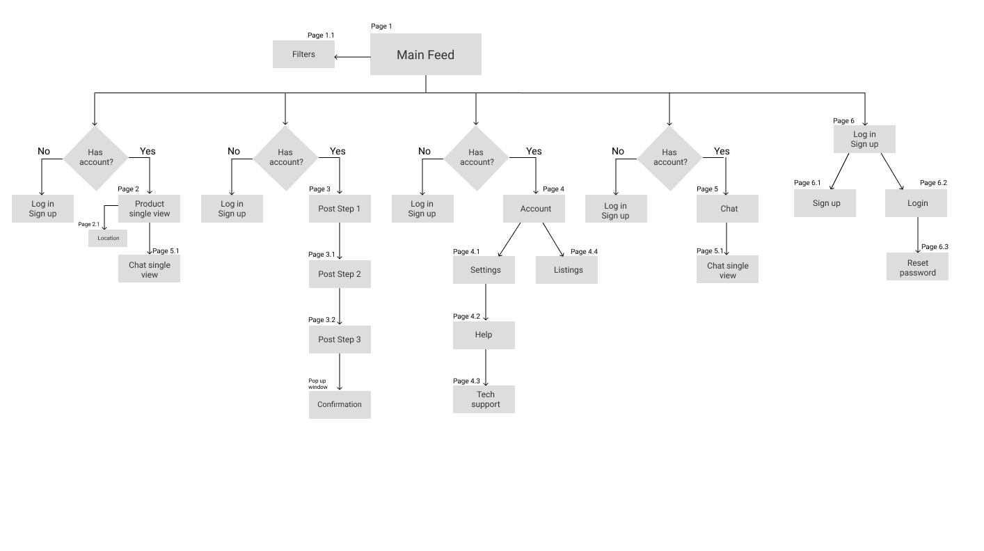
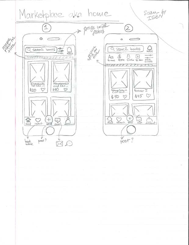
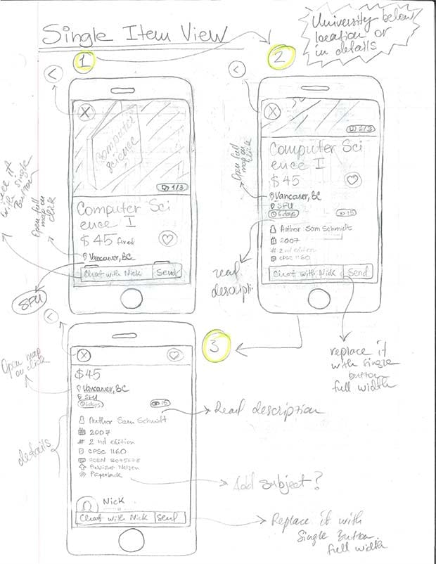
At this point I started to define a clear vision of what functionality and features the app needed. Next step was to draw it on paper:
 1
1
N1 - home page
 2
2
N2 - single product view
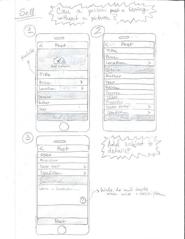 3
3
N3 - a process of posting an item
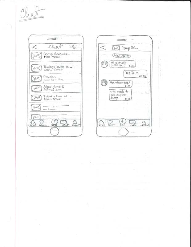 4
4
N4 - chat
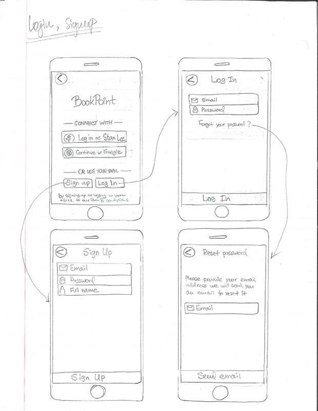 5
5
N5 - log in & sign up
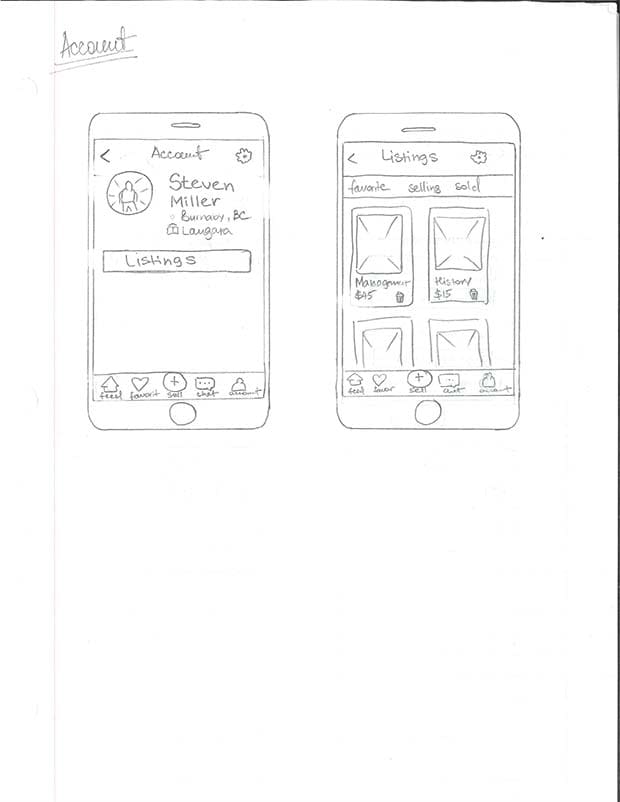 6
6
N6 - user account
Color scheme
Next, I started to add colors. And again, from the research I defined that university students (mainly from 18 to early 30's) were a primary audience of the app.
I wanted the app to look and feel young, bold and energetic. I've noticed that many marketplace apps like letgo, Carousel, Airbnb use various shades of red as their primary color.
Red looked like a good choice for a primary color. Not only it's widely used in online commerce, but also it strongly attracts human attention.
However, I didn't think about classic red (#FF0000). I was looking for something more original and found it in this example from Google Material Design:
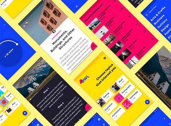
In my opinion, magenta looked like a perfect primary color. It's bold, original and energetic, which reflected main points of the message I wanted to convey to target audience.
As a complimentary color I decided to use warm yellow. It'd make the design even more bright and enthusiastic, but won't conflict with a primary color.
I added grey color to balance the color scheme and not make it excessively bright. You can see the result in the image below:

Digital wireframing
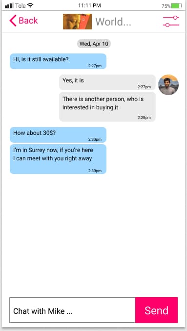
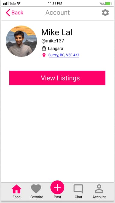
Finally, I did digital wireframing (listed are only 9 out of 20):
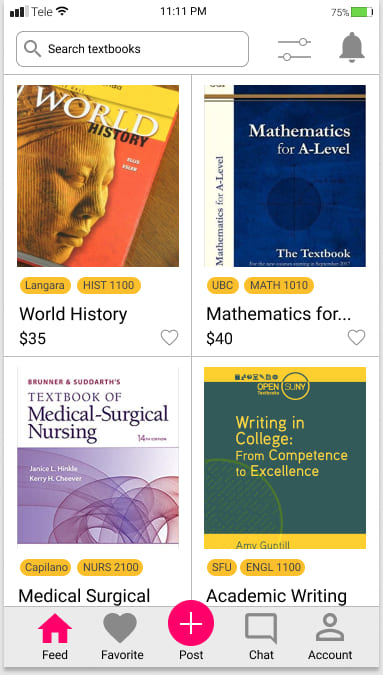 1
1
N1 - home page
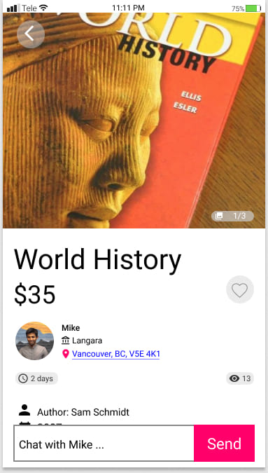 2
2
N2 - single product view
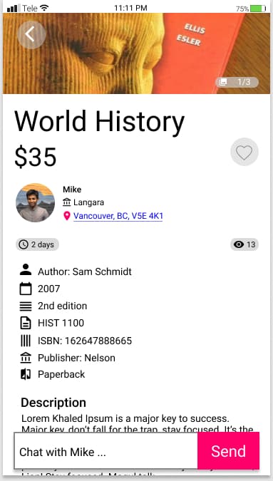 3
3
N3 - single product view continued
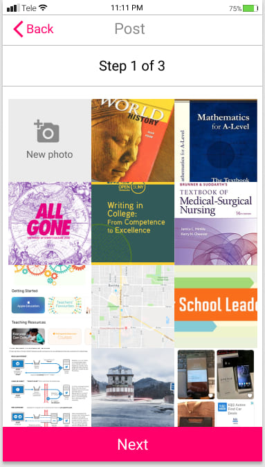 4
4
N4 - post an item, step 1 of 3
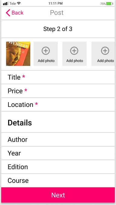 5
5
N5 - post an item, step 2 of 3
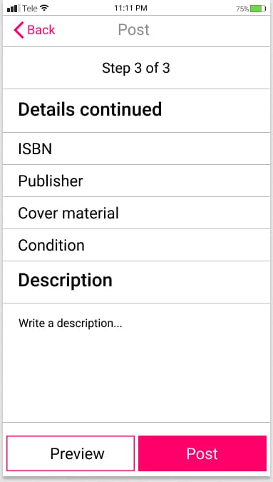 6
6
N6 - post an item, step 3 of 3
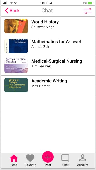 7
7
N7 - chat
 8
8
N8 - single conversation view
 9
9
N9 - account
To sum up
Thanks a lot for following my creative process from start to finish. If you remember, this app started when me and my college classmates decided to change the way students buy, sell and exchange used study books.
Unfortunately, we didn't launch this app. However, I still lerned a lot from working on this project. I practiced my UX/UI and design skills, did a thorough research and discovered lots of new things about app creation.

